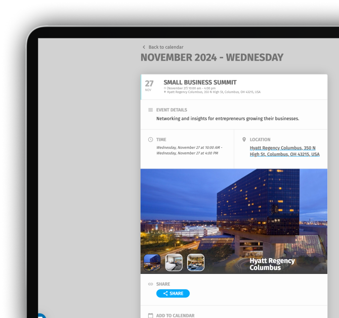
In the world of online events, a picture truly is worth a thousand words—or perhaps a thousand clicks. It's the first impression of your event, setting the tone, evoking emotions, and grabbing attention in a sea of content.
However, not just any image will do. To truly capture your audience’s interest and drive engagement, your event image needs to be tailored to the platform it’s displayed on.
This guide will walk you through the best practices for creating event images that not only look great but also work seamlessly across all digital platforms—ensuring your event gets the visibility and interaction it deserves.
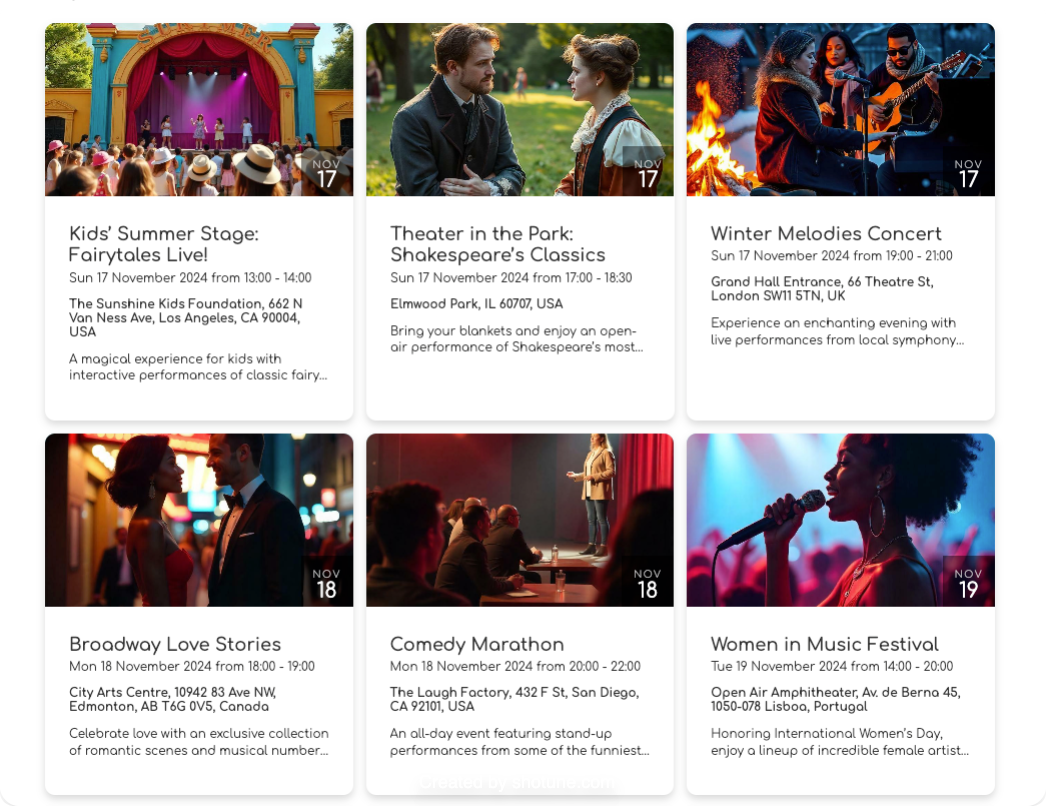
Quick Reference Guide
Choose Optimal Ratios
Use 1x1 or 16x9 aspect ratios for event images to ensure they display correctly across all devices, from desktop to mobile, without being cropped.
Avoid Overcrowded Posters
Posters designed for print often contain too much information for digital platforms. Instead, simplify your digital event image to focus on a central theme or the event's atmosphere.
Leave Room for Metadata
Digital platforms usually display key details (e.g., event name, date, and location) alongside your image. Avoid duplicating this information on the image itself—use the space creatively to attract attention.
Optimize Image Size
Use a resolution of 1200 pixels for the longest side while maintaining aspect ratios for quality.
Highlight the Event Atmosphere
Instead of packing the image with text, use visuals and colors to communicate the event's mood or theme. Engaging visuals help your event stand out in listings.
Plan for Scalability
Test your images across multiple devices to ensure they remain impactful, whether displayed as a thumbnail or fullscreen.
Proportions and Orientation: The Key to Versatile Event Images
When designing event images for digital platforms, it's essential to consider the environment where they'll be displayed. Screens vary widely: desktop monitors and laptops typically have wide, horizontal displays, while mobile devices are naturally oriented vertically. But here’s the catch—many event platforms, apps, and websites add navigation bars, overlays, and other interface elements, reducing the available space for your image.
Tip: To ensure your image looks its best on any device, stick to the golden ratios: 1x1 (square) and 16x9 (wide rectangle). These proportions are the most adaptable, allowing your image to display correctly without cutting off important details.
Why 1x1 and 16x9 Work Best
Square images (1x1):
Perfectly balanced for both desktop and mobile layouts. They provide consistent visibility and maintain their aesthetic integrity across platforms.
Wide images (16x9)
Ideal for banners, desktop headers, and video thumbnails, this ratio ensures your content remains fully visible without requiring adjustments.
| Platform | Recommended ration | Recommended image size |
|---|---|---|
| 1.91:1 | 1200 x 628 | |
| Eventbrite | 2:1 | 2160 x 1080px |
| Revisual | 16:9 | 1200x600 |
Table with recommended aspect-ration and resolution of event images
Best Practices for Digital Images
- Use 1x1 or 16x9 ratios to maintain flexibility and avoid cropping.
- Minimize reliance on text-heavy designs—platforms already display metadata like event names, dates, and locations separately.
- Keep visuals clean and focused on a central subject to ensure your image grabs attention.
By choosing the right proportions and keeping designs clean, you can ensure your event images look polished and professional, no matter where they’re displayed.
A New Role for Event Images: More Than Just a Poster
On digital platforms, event images play a different role than printed posters. While a printed event poster must include all critical details—like the event name, date, location, sponsors, and sometimes even a schedule—this approach doesn’t translate well to digital formats. On a screen, event images are accompanied by metadata such as the event name, date, and location, which are displayed separately by the platform. This frees up the image itself to serve a more engaging and visually appealing purpose.
Focus on Atmosphere, Not Overload
A printed poster needs to cram all the essential details into one design, which often leads to text-heavy and cluttered layouts. Digital event images, however, have the opportunity to:
- Highlight the theme or atmosphere: Use visuals to convey the essence of the event, such as its energy, mood, or key themes.
- Engage with simplicity: Minimal designs with a strong central subject are more likely to grab attention.
- Add compelling callouts: Use short, engaging slogans or hooks to pique curiosity without overwhelming the viewer.
Avoid Redundancy
Since event platforms already display critical information like the name, time, and location, duplicating this text in the image wastes valuable space and can make your design feel cluttered. Instead, prioritize visuals that make the event stand out in a list or feed.
Tip: Avoid overcrowding your design with text—leave space for the platform’s metadata to do its job.
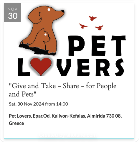
Stand Out in a Crowd
When your event is listed alongside others, a strong, visually appealing image can make all the difference in capturing attention. Instead of focusing on details, let your image tell a story. For example:
- Use colors, patterns, or a focal image that aligns with the event’s tone (e.g., vibrant hues for a music festival, muted elegance for a gala).
- Ensure that even as a thumbnail, the image remains striking and clear.
Best Practices
- Simplify: Focus on a central subject or theme.
- Prioritize visuals: Emphasize mood or atmosphere over text.
- Engage creatively: Add short, engaging slogans to intrigue your audience.
By shifting from an information-dense poster mindset to a visual storytelling approach, you’ll create digital event images that captivate viewers and drive interaction—helping your event shine in any setting.
The Pitfalls of Using Printed Posters Online
Posters designed for print are often rich in details and formatted vertically, focusing on delivering all key information in one place. While these posters look great in full-screen views, they pose challenges when adapted to digital platforms:


Cropping Issues
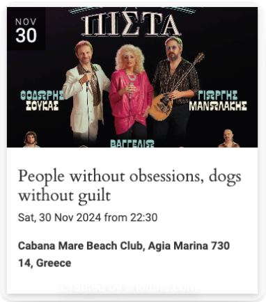
On listing pages or event feeds, the platform’s layout may automatically crop the image. If text or key visuals are positioned near the top or bottom, they risk being cut off entirely.
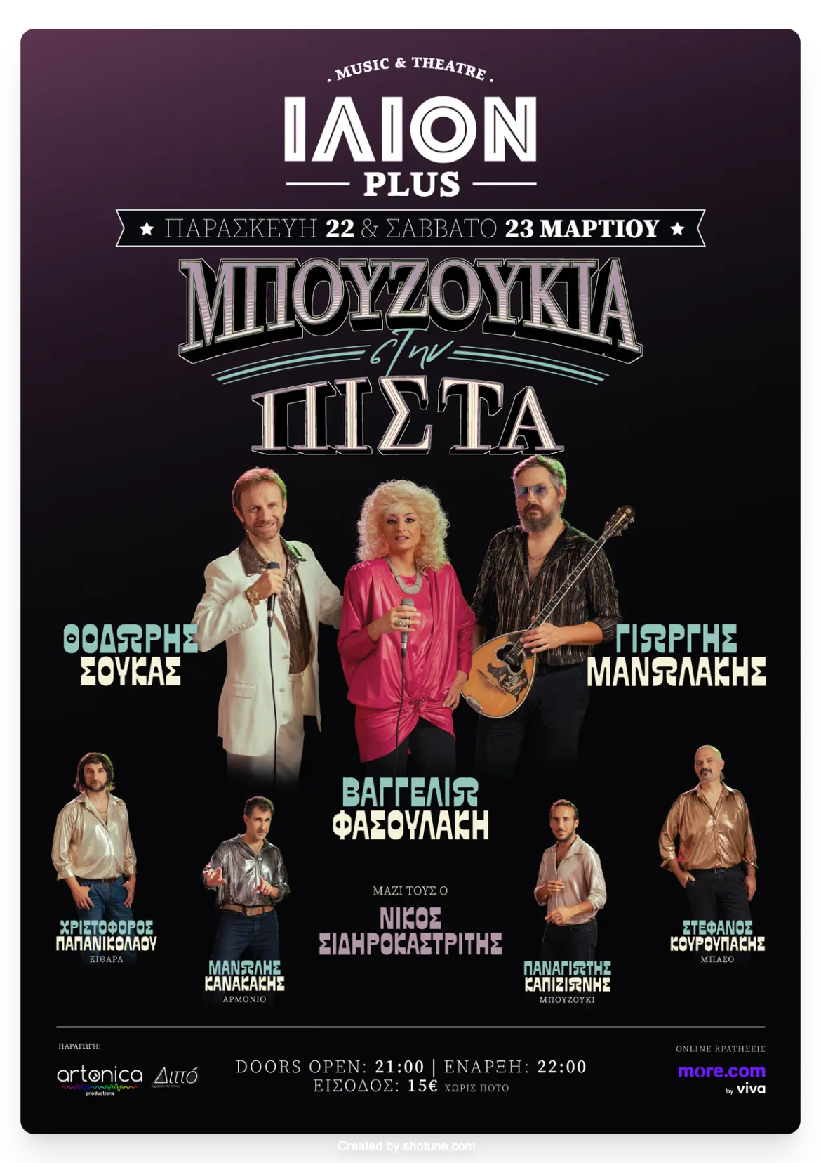
Overcrowded Designs
The dense information typical of printed posters can make them visually overwhelming on smaller screens.
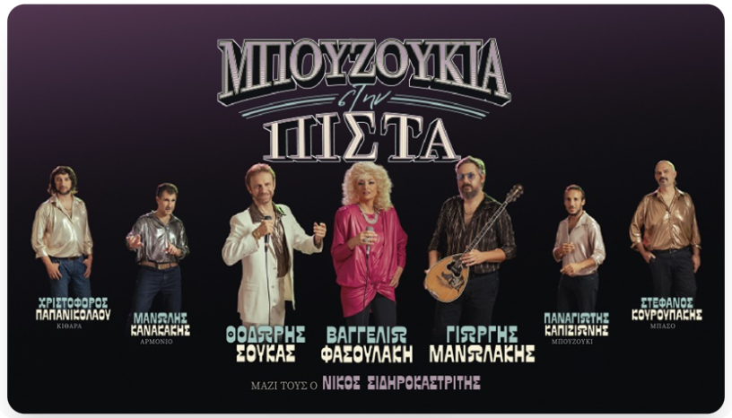
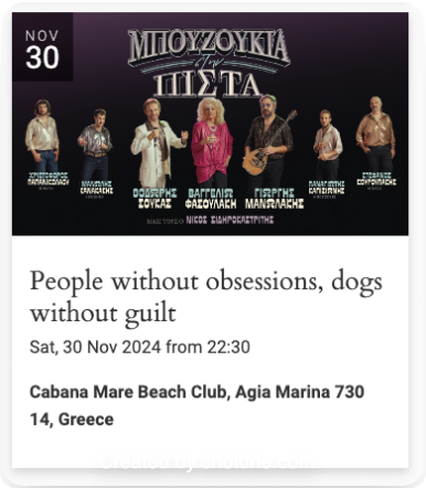
For instance, if a poster’s critical details are positioned in the middle thirds (2/5 or 3/5 height), they may get cropped or become difficult to read, reducing the image's overall impact.
Digital Images: Why File Size Matters
When crafting event images for digital platforms, quality and size go hand in hand—but striking the right balance is essential. High-resolution images look stunning on desktop screens, but their large file sizes can cause delays when loading on mobile devices, especially for users with slower internet connections.
Optimize for Speed and Quality
Large image files can negatively impact user experience, leading to slower loading times and potential frustration. To avoid this, resize your images to a practical resolution that maintains visual quality while reducing file size.
- Recommended dimensions: Resize images to have a approximately of 1200 pixels on the longest side, with the shorter side adjusted proportionally. This size ensures clarity without unnecessary bulk.
- Why it matters: Faster-loading images improve user engagement, particularly on mobile devices where internet speeds can vary significantly.
Go a Step Further with Compression
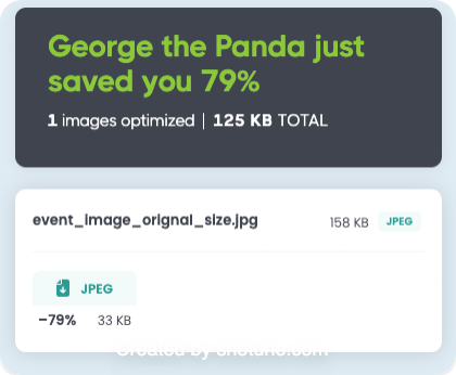
To reduce file sizes even more without sacrificing quality, use free compression tools. These tools optimize images by removing unnecessary data while preserving their visual appeal.
- Recommended tools:
- TinyPNG: A simple, effective, and free tool for compressing PNG and JPEG files.
- Other alternatives: Tools like Squoosh or Compressor.io also provide excellent results.
Best Practices Recap
- Resize images: Stick to 1200 pixels on the longest side for a good balance between quality and speed.
- Compress smartly: Use online tools like TinyPNG to reduce file size further without losing quality.
- Test your images: Preview how they load on both desktop and mobile devices to ensure optimal performance.
By optimizing your event images for size and quality, you’ll create a seamless experience for all users, ensuring your event stands out without slowing down. These small adjustments can make a big impact on engagement and accessibility, ultimately leading to greater success for your event.
Tips & Tricks for Perfect Event Images
Here are some quick and practical tips to ensure your event images are effective, organized, and easy to manage:
1. Make Filenames Meaningful
Name your image files with relevant keywords, including the event name and key details. This helps with:
- SEO: Search engines can better understand and rank your images.
- Organization: Makes it easier to identify images later, especially when working on repeat or recurring events.
For example, use filenames like
summer-music-festival-2024.jpg
instead of generic names like
image1.jpg
2. Store Images in One Central Location
Keep all event images organized in a single, dedicated location, such as a folder on Google Drive.
- Easy Access: Quickly find files when needed for promotions or future event editions.
- Team Collaboration: Easily share images with team members or collaborators.
- Integration Benefits: Google Drive integrates seamlessly with tools like Google Calendar, making it simple to attach images to events.
3. Test Images on Different Devices
Before finalizing, preview your images on both desktop and mobile devices to ensure they display correctly.
- Check for Cropping: Ensure no critical elements are cut off on smaller screens.
- Assess Visual Impact: Make sure the image remains clear and engaging, even as a thumbnail.
By implementing these simple but effective practices, you can streamline your workflow, improve the discoverability of your events, and create a consistent, polished look across all platforms.
Conclusion: Make Your Events Stand Out
By following these best practices, you ensure your event images not only look stunning but also function seamlessly across platforms. From choosing the right proportions to optimizing file sizes, every detail contributes to creating a professional and engaging visual presence for your events.
With Revisual, you can take your event presentation to the next level. Revisual seamlessly syncs with Google Calendar, allowing you to enhance your events with cover images pulled directly from attachments. This transforms your calendar into a visually engaging and interactive experience, helping your events stand out and attract more attendees.
Whether you’re showcasing a lineup of performances, workshops, or conferences, Revisual ensures your events are presented beautifully, increasing the likelihood of ticket sales and participation.
Ready to make your events shine? Try Revisual for free today and see how effortless it is to create an engaging, visually impactful calendar. Click here to get started!

